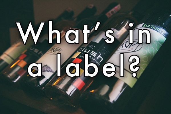
Wine labels on bottles used to be rather simple and classically similar just identifying the contents. Remember how the unique artistic Chateau Mouton-Rothschild labels really stood out from the crowd. There were exceptions like German wine labels that were very complex and hard to understand. Boy has everything changed! Now it has become a thriving industry for competing graphic designers. I understand how many wineries want their products to be progressive attention getting almost “jumping off the shelf” in telling the story that will remain in your memory. However I guess I am still old fashioned in focusing mainly on the liquid with less attention paid to the showy art.
In Canada Bernie Hadley-Beauregard has developed innovative labels that sell wine looking for ” a consumer connection via a memorable name and a compelling narrative that sparks curiosity and conversation”: http://www.macleans.ca/culture/this-wine-looks-good/ . Even Forbes has a posting of attractive bottle shots on “The Coolest Wine Labels of 2013:Part II” on their site at http://www.forbes.com/sites/katiebell/2013/11/01/the-coolest-wine-labels-of-2013-part-ii/ .
I like informative back labels and the contents listing pioneered by Ridge Vineyards and others. I still like clear graphics to easily see the vintage. Also prefer readable alcohol levels rather than the California trend for microscopic numbers that can not be seen so the higher alcohol level doesn’t scare you off. Dislike “critter” labels whether a bird, beast or insect. Not into a display wine cellar of art objects but a workable cool humid one that protects the wine and may deteriorate the label. Encourage labels with “smart” computer technology to avoid counterfeiting. I am easily satisfied with just black labels and white printing – don’t necessarily have to have jazzy color gradients with cool fonts. Still like the plain label of Chateau Palmer. What makes a wine label attractive to you and entices you to buy the bottle?
I remember watching a documentary a few years back on how companies fight tooth and nail to have their product placed at eye level on the shelves of grocery stores. The idea is that you are more likely to see and therefore buy that product than one at the top or bottom of the shelf.
My guess is that it’s the same thing for liquor stores. If you can’t be seen at eye level, then you need to do something that catches the attention of a potential customer. Bright colors, trendy fonts, exotic gradients or uniquely shaped bottles – whatever it takes. The Gallo’s of this world won’t cede even one percent of their market share without a fight, so if you’re a smaller winery, you need to think outside the box in terms of graphic design.
I can’t count how many times I’ve bought wine and overheard someone telling their spouse “Oh, that’s a nice label, let’s buy this one.” It works. The era of a black castle placed on top of a beige label is dead – especially with Millennials becoming a bigger force in the marketplace.
I agree with Joseph Temple in that I am convinced that many people buy wine based on the cuteness, cleverness, or pizzaz of the label. Personally, I would never buy a wine solely because I liked the label, but that doesn’t keep me from enjoying or being amused by unusual labels.